SWISS' purchase
process
Swiss International Air Lines' Flight Booking reconstruction.

Project Overview
In order to complete ESPM’s UX Design course and obtain my professional certificate in UX Design from the UX Design Institute, I worked for one semestre on an academic project to improve an airline’s website process.
As an avid traveler, I had the chance to try various services, and my encounters with SWISS stood out for having one of my smoothest onboard experiences at the same time as presenting one of my least favourite experiences while buying the ticket. Therefore, it seemed like a perfect choice to take on the challenge of bringing this brand’s uniqueness to the screen.
Below, you’ll have the chance to dive in with me into my working process from figuring out the main areas of improvement to designing screens that would surprise clients though maintaining the Swiss International Air Lines’ brand identity.
... But, back to the start, the initial question that kickstarted my research was:
"
How can I improve Swiss International Air Lines’ purchase process?
Wanna jump straight to the finished product?
My role
UX/UI Designer / Product Designer
Process
Research, market analysis, qualitative interviews, comprehension tools, ideation, prototyping, testing, evaluation.
Scope
6 months
Tools
Figma, Miro, Adobe Photoshop, Adobe Illustrator, Procreate, Notion, Zoom, Lookback.
Phase
Immersion &
Research
Comprehension
& Analysis
Ideation
& Design
Test & Validation
CSD matrix
Before diving into the benchmarking phase, I decided to create a CSD matrix in order to better understand the specifics of the challenge ahead.
Being outside the working team at SWISS, this phase was highly valuable for me to know more of the company’s current situation, as well as its history. The certainties, suppositions, and doubts acted as a cornerstone for the research map I drew for the next phases.


Benchmarking
Every market has its own predefined patterns and conventions and the first step of the research was to understand those, at the same as I gained insights into the competitors’ potential good and bad practices, current trends, and the overall structures and flows.
The benchmarking phase was divided into five categories: Swiss airlines (3), European airlines (5), international airlines (6), low cost (3), and trains (3), amounting to a total of 20 companies analysed.
Qualitative interviews
After dissecting the market, the next step was to talk with possible and current users of SWISS’ services. I’ve conducted five in-depth interviews aiming to gather information to create, in the next steps, personas, user journeys, empathy maps, blueprints, and the customer value curve.
The information obtained in the talks was also essential to draw insights I could cross with the ones gained in the previous benchmarking phase.

Usability testing
The first five usability tests were done in the same meeting as the qualitative interviews. They consisted of two different tasks related to the ticket purchase process with specific scenarios that would demand extra effort from the user (particular dates, an infant traveler, etc.).
The users tested SWISS’ and one of its direct competitors’ website (KLM). All the insights were crossed with the ones from previous phases and served as a guide for the design reconstruction.
Phase
Immersion &
Research
Comprehension
& Analysis
Ideation
& Design
Test & Validation
Affinity mapping

Once the benchmarking, quality interviews, and usability tests were completed all the insights gathered were clustered in groups with similar themes. Some of the topics were: shopping carts, sustainability, and toddler traveling instructions, amongst others.
The affinity mapping here was key to organise the research findings and facilitate the creation of different analysis tools, as well as already list possible new features and improvements that need to occur in the shopping process.
Persona development
Creating the personas is an important step that enables us to embody insights into fictional users based on information from real people. I divided the insights from the research phase into two people with different travel habits, interests, influences, goals, needs and expectations, motivations, and pain points and frustrations.
In another attempt to visualise the research findings more concretely, I created a mock version of each persona’s phone in a way that reflected the apps and the habits mentioned in the interviews. An example can be the importance given to sustainability and the use of apps such as Vinted (a marketplace for second-hand items) and TooGoodToGo (a service that connects users to restaurants and food markets that have surplus unsold food).


User Journey
As a visual representation of the steps a user takes to achieve a specific goal within a product or service, creating the user journey map for my personas was an extremely important process for me to fully comprehend the variables that dictate SWISS’ plane ticket shopping experience from the awareness to the loyalty phase.
The pain points’ and opportunities’ sections confirmed some aspects already highlighted as “with room for improvement”, such as a better clarification of what’s being paid in each step of the purchase, for instance.

Blueprint
Another diagram that helps us understand the user’s itinerary in our product, the blueprint outlines the components and interactions in a way that facilitates the comprehension of how the scenario we drew plays out.

Empathy mapping
Based on the quotes of the qualitative interviews I’ve also created an empathy map for each persona. Filling the sections what (s)he “hears”, “sees”, “says and does”, “thinks and feels”, “pain” and “gain” helps me gain deeper insights into the user’s perspective, fostering a connection with the target audience.
By putting a human face on user data, it helps ensure that design decisions are empathetic and user-centred. Therefore, this is an essential step before ideation and design begin.


Customer value curve
Finally, I put together a customer value curve comparing SWISS to KLM based on the insights received in the usability tests (the volunteers tested both shopping processes). The choice of KLM was since during the benchmarking phase, it was the direct competitor with features I initially deemed better structured/clearer. Therefore, I wanted to explore during the research.
The customer value curve validated my initial theory and the flight selection, fare selection, selection summary, and general usability, KLM surpassed SWISS’ usability according to the users interviewed evaluation.
Phase
Immersion &
Research
Comprehension
& Analysis
Ideation
& Design
Test & Validation
User flow
For me, a great way to start the ideation phase is by drawing out the process’ user flow. By walking through the experience with the user’s shoes on you can address possible roadblocks before they become major problems. Here, the actions become more real, and I can start envisioning the content and possible division into screens.
In the SWISS’ case, I recreated the current ticket purchase process to see it step by step, and afterward, I started signaling where improvements could be made and in what way.

Content inventory

Walking hand in hand with the user flow, the content inventory is an important tool to dissect what the current product has and what we will need to add, or subtract. In this case, I used the user flow structure to work on the content behind each step, which helped me visually.
Having this inventory set is essential when the designing process begins.
Impact/effort matrix
Before starting to design the screen sketches, I used the Impact/Effort Matrix to evaluate how each action and feature should be prioritised.

Low fidelity wireframes
Sketching interfaces is a fun but long process. It’s time I reassess all the research information and analysis done so far. With a final affinity mapping session based on the features chosen to be prioritised with the impact/effort matrix, I start drawing.
The low-fidelity wireframes creation happens all the time with a side window open where I can go through the user flow, and the user journey… and make sure the screens being produced correspond to the user’s real needs.

Branding
By working with a brand as established as SWISS, it is imperative that the main features of the brand identity are kept and valued. Therefore, the first part of the work behind the high-fidelity wireframes was recreating the design system in use to, finally, be able to increment the changes needed.
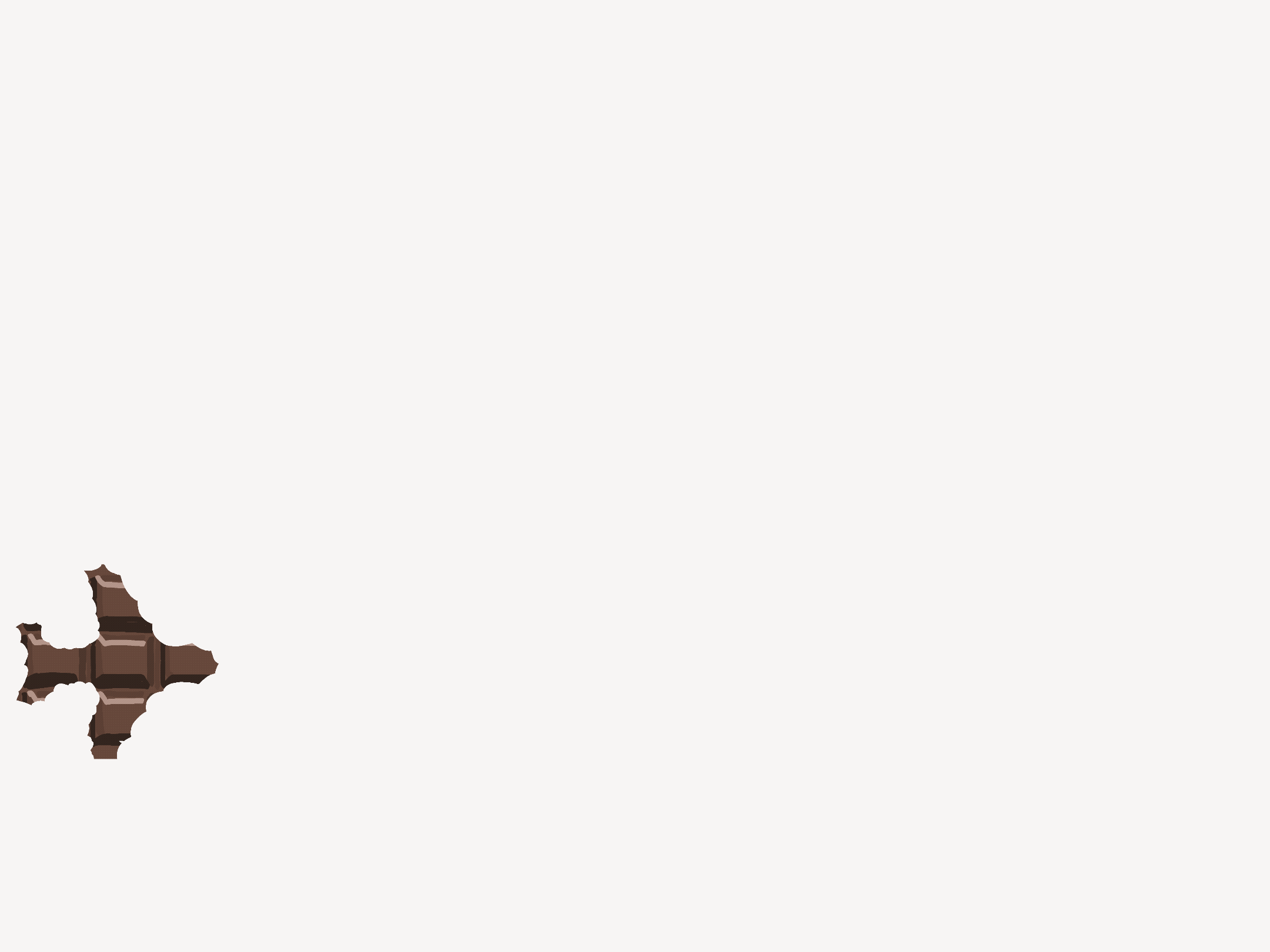
Once the main features were updated, I allowed myself to add an extra flavour to the user experience by adding some animations that used the famous mini chocolate bar given by the company during their flights. The goal was to bring the traditional SWISS' branding into a new lighthearted light.
High fidelity wireframes
One of the most demanding, but most rewarding phases, the creation of the high-fidelity wireframes is when we see all the months of work coming to life. As mentioned in the previous section, keeping the brand identity was a worry throughout the whole process, so one of the biggest challenges in this phase was to add new, surprising, features in a way it would feel natural to the user.
Amongst the biggest changes applied, I can mention:
-
a clearer communication of different fares according to the age of the passenger from the get-go;
-
a clearer visual communication disclosing to the user what flights are the cheapest, fastest, recommended etc.;
-
visual aids in every flight explaining the length, amenities, and airports, amongst others;
-
a progress bar;
-
a shopping cart;
-
a clearer process regarding the travel of pets;
-
visual aids during the payment process.
In this video, I walk you through the ticket purchase journey in the newly updated SWISS website.
Phase
Immersion &
Research
Comprehension
& Analysis
Ideation
& Design
Test & Validation
Usability testing #2
The last usability test was made with three new volunteers consisting of a similar task to the first usability test sessions: related to the ticket purchase process with a specific scenario that would demand the user extra effort (particular dates, an infant traveler, etc).
It’s an important phase to gather feedback, implement small changes and errors noticed, and register suggestions that would require a more global update of the project.
In sum, I can say the final sessions were extremely positive and it was truly gratifying to be able to see other people testing and approving the work that was done.

Learnings and Recommendations
During this project, due to its academic factor, I had the chance to explore some different tools and approaches I hadn't so far, such as creating a customer value curve and blueprints. And, overall, it was an enriching experience because of its challenging aspects, for instance: the restraints of a traditional market, and the limitations brought by the already-established brand.
Working on the SWISS website as I am, myself, a user was intriguing, but also a good reminder to rely on research and not fall into the temptation of leaning into personal experience. Improving the purchase process was, then, always thought with both users and the company in mind. "How can I improve SWISS' retention rate?" was most of the time answered with the same response I got when I questioned, "how to improve the client's experience?". For me, that's when you know your product is heading in the right direction.
As with every project, there is still room for improvement, and the findings of the last usability tests have been listed as possible future changes. As always, feel free to message me so we can talk further details!,