John Deere's
Landing Page
Redesigning the internship application journey.

Project Overview
John Deere is a global powerhouse brand and one of the most respected industrial employers in Brazil, yet many students still arrive at the internship application page uncertain about the company, the work environment inside the factories, or even whether their academic background fits the program.
This gap in clarity and positioning can discourage potential candidates and reduce the number of qualified applications. Working alongside ABRH Estágio and John Deere, I identified an opportunity to strengthen the company’s employer brand among young talent by creating a landing page that clearly communicates the internship journey, showcases the value of joining John Deere, and guides students through the process with confidence and transparency. The goal was simple: make the experience clearer, more inviting, and ultimately increase applications.
The question that guided the project was:
"
How can we redesign the internship landing page to reinforce John Deere’s employer brand, clarify the entire application process, and encourage more students to apply with confidence?
Wanna jump straight to the finished product?
My role
UX/UI Designer
Process
Research, market analysis, qualitative interviews, ideation, prototyping, testing, evaluation, creation.
Scope
4 weeks
Tools
Figma, Miro, Adobe Illustrator, Notion, ChatGPT, Zoom, Framer.
The challenge today
Lack of clarity for different academic backgrounds
John Deere offers internship opportunities across multiple areas inside its Brazilian factories, from engineering roles to communication, HR, and business tracks. Yet many students, especially those from humanities, land on the application page unsure if the program has a place for them.
Employer branding gaps for younger talent
While John Deere is widely respected in the agricultural and industrial sectors, its employer branding is not always as visible or accessible to students seeking their first professional opportunity. Without a clear message about what the company offers, how the factories operate, and the long-term growth potential, many students overlook John Deere as a possible career start. Strengthening the digital presence became essential to attract a new generation of interns.
Complex or unclear application journey
The internship application was spread across different pages and platforms, making it difficult for students to understand the steps, requirements, and timeline. This complexity discouraged candidates and reduced application volume. Creating a central, intuitive landing page with a clear, transparent process became key to increasing applications and making the journey more welcoming.
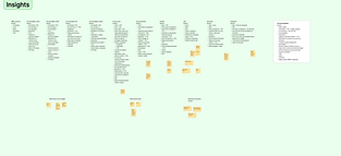
Research
After the kick-off meeting, I began the research phase, which was divided into three main stages: secondary/market research, four qualitative interviews, and persona development.
Throughout the analysis it became clear that internship expectations varied significantly depending on both the company type (e.g., start-up vs. established industry) and the student’s field of study (STEM vs. Humanities/Social Sciences).
This insight led me to develop a comparative matrix that was later presented to the client and used as a strategic reference to guide key decisions for the landing page structure, as well as future campaign adaptations.
.
Qualitative interviews
For the qualitative research, I conducted four semi-structured interviews with students referred by the internship agency. This format allowed me to explore their expectations, motivations, frustrations, and what they look for when evaluating internship opportunities. Hearing directly from students helped me understand not only the information they prioritise, but also the mental flow they follow when deciding whether to apply. These insights were essential in defining the structure of the landing page; from which sections needed to be included, to the order in which information should appear to create a clear, intuitive, and engaging experience.
Secondary/Market research
As part of the secondary research, I conducted a benchmarking analysis of more than ten internship programs across different agencies, sectors, and communication styles. This helped me identify common patterns, best practices, and opportunities for differentiation. By comparing elements such as tone of voice, visual hierarchy, application flows, value propositions, and how companies communicated their culture to students, I was able to map the strengths and gaps in the current market. These insights provided a solid foundation for defining what the John Deere internship page needed to communicate; not only to align with industry standards, but also to stand out in clarity, relevance, and appeal to young candidates.

Persona development
Based on the research insights, I developed two primary student personas that represented the main behavioural groups applying for internships: STEM students and Social Sciences/Humanities students. To better understand how each group interacted with different types of companies, I also created complementary company archetypes (from start-ups to large industrial organisations). Mapping both sides of the experience allowed me to identify where expectations aligned or diverged, and where John Deere could differentiate itself in terms of clarity, value proposition, and communication style. These personas served as a strategic compass throughout the project, ensuring that the landing page addressed the needs of diverse candidates while highlighting John Deere’s strengths.


User Journey & User Flow
To translate the research insights into a clear experience, I created two user journeys (one for the STEM student persona and another for the Humanities/Social Sciences persona). Each journey mapped out how these groups typically discover, evaluate, and apply for internship opportunities, highlighting their distinct motivations and decision points. From there, I developed a unified user flow that brought both paths together, allowing me to visualise the complete process end-to-end, including its touchpoints with the marketing team’s outreach and the recruitment platform used by ABRH Estágio. This alignment helped ensure the landing page structure supported real user behaviour while also fitting fluidly into the operational process behind the internship program.

Low Fidelity Wireframes
With the user journeys and user flow defined, I moved on to low-fidelity wireframes to translate the structure into its first visual form. At this stage, the goal was to focus purely on hierarchy and flow rather than aesthetics.
The wireframes allowed me to test how information would be grouped, where students naturally expected to find key details, and how the page would guide users toward the application with minimal friction. Using the insights from the interviews and the comparative matrix, I organised sections such as ‘Why John Deere,’ program details, FAQ, and the application CTA in a sequence that matched students’ decision-making logic. These early sketches also helped the team validate the connection points between the landing page, the marketing funnel, and the recruitment platform before moving on to higher-fidelity design.

Branding
This internship program landing page was designed to live inside the ABRH Estágio website, separate from the company’s main site. This gave me the freedom to explore a younger and more casual tone, adapting the experience to a student audience.
Still, it was important to keep the page aligned with John Deere’s brand, especially in terms of visuals and colour guidelines, to ensure consistency across all touchpoints.


High Fidelity Wireframes
& Protype
Once the ideation phase was complete and the branding guidelines were fully defined, I moved on to creating a prototype to be tested before going live with the first campaign. Because the company needed a landing page that could be easily updated every semester and seamlessly connected to the recruitment platform - while still maintaining an independent visual identity - we chose to build it in Framer. This decision allowed for fast development, intuitive iteration, and quick fixes for future program editions.
Due to the tight timeline of the current internship cycle, a few planned sections were temporarily hidden or postponed. For example, the testimonials section, initially considered essential for credibility, became unfeasible to produce (filming, editing, and approvals) within the available time. These elements were documented for inclusion in the next update.
Below you can explore the final prototype used for the usability testing sections:
Usability Testing
For the usability testing phase, I conducted 3 remote sessions with a new group of students to evaluate clarity, navigation, and overall comprehension of the landing page. These tests helped me identify how easily students could find key information, understand the application flow, and connect with John Deere’s value proposition. Although the interface was fully responsive, feedback revealed that the tractor animation behaved inconsistently on larger screens, which required performance adjustments. Additionally, recurring questions from users (raised in two out of the three conversations that focused on content) led to the inclusion of an extra Q&A item in the FAQ section. These refinements ensured the landing page was not only visually aligned with the brand but also functional, intuitive, and adapted to real user needs.
Delivery
The delivery phase was smooth thanks to continuous communication with both the John Deere and ABRH Estágio teams throughout the project. Once the final version of the landing page was approved by both companies, I coordinated the technical alignment to ensure its proper connection with the recruitment platform used by the agency. This included validating application flows, testing redirects, and confirming that all data points were captured correctly. With these steps complete, the landing page was ready to go live for the internship campaign, fully functional and aligned across all stakeholders.
Learnings and Recommendations
This project immediately connected me to a previous experience I had working with employer branding, and that familiarity ended up enriching and guiding the entire process. Understanding how a brand speaks to talent - and how it positions itself emotionally and visually to young professionals - gave me a strong foundation as I moved through each step of the redesign.
One of the biggest lessons came from designing for two very different audiences at the same time. Students from engineering and technical fields have expectations shaped by innovation, machinery, and industrial culture; meanwhile, humanities students look for purpose, people-oriented environments, and clarity about where they fit inside a factory ecosystem. Balancing both narratives, without diminishing either one , made me rethink how we talk to users, and how inclusive UX must be when the goal is attracting diverse talent.
Another meaningful learning was how essential clarity is for early-career candidates. When students don’t fully understand the application journey, they often assume the opportunity “isn’t for them.” A redesigned landing page, therefore, becomes much more than a visual refresh; it becomes a bridge between a global brand and the next generation of professionals who might never have imagined themselves at John Deere.
As with any complex redesign, there is a clear roadmap for future improvements: refining segmented content for specific course areas, strengthening employer-branding messaging, expanding accessibility considerations, and integrating real intern testimonials to amplify authenticity. These enhancements can continue transforming the landing page into a high-impact recruitment tool.

